Tuesday, April 21, 2009

Postcard


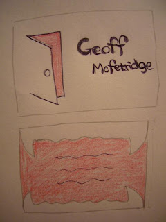
This is my final postcard.
This project was really fun, although it was hard because I'm not use to use illustrator.
I designed a door for the front side and fangs for the back side because I wanted to give an imagination of when you open the door (which is the front side), Fangs are waiting for you (which is the back side of the card). I thought this idea is similar to Mcfetridge's idea. Some of his design with doors continues with the front of a door or the back of the door. Also, I tried to use two colors, red and white, because this is also Mcfetridge's style. He usually use two colors and use negative space.


This is another postcard that I made.
I also use his idea of using two colors and negative space.
I put a whale for contrast because this is more balanced between the front and back side of a card. Moreover, to make this card more balanced, a front side is light blue for the background and white for the background on back side. I chose to use these letters because most of font that Mcfetridge use are very simple font. This is why I chose to use these letters.

Thursday, April 16, 2009

Tuesday, April 14, 2009

Research

I decided to do Geoff McFetridge.
Here are some of his work...


I think basically his works are using illustration, and he makes use of the form of both negative space and positive space. Moreover, he basically uses color define using two colors.

-------------------------------------------------------------------------------------------------------------------

This is my process of design


I try to figure out what his design style is from research.
I want to design using negative space like Mcfetridge does, and I want to use a color define using two colors (I don't know what color I'm going to use yet...).


Final Patterns

Pattern designing was fun to do as a project. It was first time using Illustrator to design pattern. I enjoyed myself designing patterns. At the same time, it was really hard to figure out what and how i want to do to design patterns. Although, it was great to have time to see what and how my classmate design patterns.

1. Final Pattern


My first pattern is this. I used a letter V for this. For this design, I tried to use negative space, spaces figures, and figure ground. Especially, I wanted to use the negative space nicer and a little bit complicated. I wanted to make a rhythm in my pattern so, there are thinner lines and thicker lines.

2. Final Pattern


I used V for this pattern. I know this is pretty simple and easier to recognized that this is V, but I still like this pattern a lot, so I decided to post this pattern. These are made by same font, but different sizes, but I think it is balanced.

3. Final Pattern


This is designed by a letter O. First, when I was imaging this is like flowers.But, many classmates told me that this looks like a symbol of Olympic, since then it looks like a Olympic one. I tried not to pile Os together because I thought it would be boring if I piled Os together. By making some space between Os, this has more interests, like you might be able to see another small flower that has four petal inside of flowers. I like this pattern.

4. Final Pattern


This is a letter
V and I use this letter with Vivaldi Italic. On flicker, I got a lot of good advices from my classmate, so I was trying to improve my first project, and this is the result. I wanted to make use of the form of the circle in a negative space. I tried to make this design look like there are more circles in bigger circles. Moreover, as some of my classmates told me, the first design make people's eyes busy and confuse because the design was to small. So, I make Vs bigger than the first one.

5. Final Pattern


For this pattern, I used K. Using two Ks putting together I tried to make a diamond using negative space. Moreover, by putting two round part together, the negative space can show you sharper diamond, too. I thought it is interesting to be able to show you the repetition of circle and diamond through positive and negative spaces.

6. Final Pattern


For this pattern, I used &.
For this one, I wanted to use a bold letter.
I also wanted to be this pattern flowing this time.
It came out like a throwing knife or knife in the mixer.

7. Final Pattern


This time, I tried using colors with a letter V.
For this, I aimed to design a pattern using color define.
I used green and yellow for this one because the back ground is white, so i wanted to use one with lighter color and the other color with darker but similar and much with other colors. Moreover, I wanted to make this de
sign fluffy and looks like a chain.

Thursday, April 9, 2009

Adobe live docs

The beginning of the day that I started to take Art 120, I have no ideas how to use illustrator. However, as I take this course, I started to learn more of how to use illustrator in class and through adobe live docs. Adobe live docs are very good resources to learn about Illustrator CS3. When you click this site (www.adobe.com/go/learn_videotutorials), it shows all kinds of adobe workshop by category. The video explain about Illustrator well from basic skills to advanced skills, so it was easier to understand. It was very helpful. Also, Adobe live docs save some times because each sections are very short, so if I don’t know about something, I can always visit this site and learn about what I don’t know. I will use the skills I earned from this site for my project more and I will use this site to gain more skills or use this site as a resource from now on.

Wednesday, April 8, 2009

Labus


This artist is Labus. I like his work where his work is detailed and had a three dimensional effects. I also like how he uses lines on the right side. especially the white lines have more impact than others. also, the vertical line with a thick shadow also has a impact and it also looks like that the line makes the three dimension. It looks like the leaf is floating a little bit. It looks like the leaves have a dynamic impact. I would like to know why he chose to design this.

Simona Pfreundner


This artist is Simona Pfreundner. This artist works on printing, packaging, and illustrations. I like this artist’s work created two different effects which are one with ice cubes and the other one with flames for absolute vodka. I think they are interesting that I imaged that the one with ice cubes has cool and plain taste, but the other one with flames has hot and dry tastes. It also shows that these two pictures are angel and devil. I can see that pretty easily. I would like to know why this artist chose to design vodka with ice cubes and flames, why not other subject. Are there any meaning of why this artist decided to create with ice cube and flames?